I am a developer, not a designer. I have no talent for UX design. With proliferation of smartphones, tablets, and app stores, this type of attitude is in the best case arrogant and in the worst case self destructive. Users rule in the world where hundreds of thousands of apps are available at their fingertips. They can install or uninstall an app with virtually no effort. A research has shown that an app has between 8-30 seconds to impress a user before he uninstalls it.
A successful app does not only provide great functionality, but also a pleasant users experience. UX is at least equally important as app functionality in my opinion. If that is the case, then a good developer must posses skills to create an enjoyable user experience. How do I do that if I am not talented? Recognize that UX design is a craft: art + science. Having no talent means that you are only lacking the art part of it. You can still learn the science part by applying proven and established design principles.
This post summarizes the two talks I attended at Visual Studio live conference in Orlando 2011. They were both delivered by Billy Hollis, a UX genius in my opinion. Here is what Billy had to say about user interface design principles.
- Pareto principle tells us that 80% of time 20% of app options are used. Design the app so that it is easy to locate and use those 20% most used options.
- Fitts’s law teaches us the time required for a user to click/tap on the target (button, slider, or any user control) is a function of distance (mouse or finger) and the size of a target.
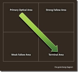
- Gutenberg diagram shows how our eyes follow the screen.
Let’s see what the UI would look like if we would embrace Pareto principle, Gutenberg diagram, and apply Fitt’s law. The UI would highlight the most commonly used options and position them at the top left corner of the screen. The options would be represented as a large target (button, text, etc.) so they can be easily clicked/tapped. The cancel or any other the least frequently used options would be located at the bottom right corner.
Empty space is good. Hick’s Law tells us that time required to locate an option increases as new options are added. Avoid bloating the UI with new options just because you can. The more options does not translate into better software. The Savannah preference reinforces the notion that empty space is good. Empty space makes us feel calm and secure. Throughout evolution we liked the empty space of a savannah because we could spot the danger and not have to worry about getting attacked by a beast jumping out from behind a tree. Embrace the clean UI that is a clutter free.
We do not need to trade the functionality for a pleasant UX. Our software can still be rich in functionality by utilizing concept of Progressive disclosure. Present the 20% most commonly used options first and then gradually based on user interaction disclose other functionality of the system. Providing the search functionality is another tool application should provide for locating those 80% less commonly used options quickly.
Biophilia hypothesis suggests that there is instinctive bond between humans and other living beings. We are attracted to natural colors such as green which in nature symbolize the prosperity. Humans associate green with healthy food and abundance of it. On the other side of the spectrum, shades of brown are associated with dying plants, drought and potential famine. Furthermore, solid colors are very rare in nature. Sky is not solid blue color. Sun is not solid red or orange color. They transition from one color to another. Our eyes have evolved to prefer smooth transitions between colors. We should exploit this fact by using the gradient when choosing color scheme for the application.
User controls with rounded edges are perceived as more user friendly. Humans do not like sharp objects. We feel uncomfortable around them. They are dangerous because they may hurt us and inflict pain on us. We should keep this in mind when designing the UI. User controls with sharp edges do not put us at easy as do the ones with rounded edges.


Too many options at once confuses many users There is an interesting article on http://contrast.ie/blog/swiss-army-knives/ discussing how to prioritize features.